Frequently asked question (FAQ) pages not only serve as a
way for your audience to quickly find answers to the questions that they many
have about your business or industry, but they also serve another important
purpose – they can help your search engine optimization efforts.
FAQ pages have been gaining traction as a marketing tool
again with the growth in voice search, mobile search and personal/home
assistants and speakers. That’s because these types of search results usually
rely on Google Answers and Featured snippets, which give succinct and
informative results.
An effective FAQ page:
- Reflects your audience’s needs
- Covers a broad range of intent
(transactional, informational, locational)
- Is kept up-to-date as you get new
data insights
- Draws in new visitors to your
website by solving problems
- Drives internal pageviews to other
important pages
- Fuels blog (and deeper content)
creation
- Showcases expertise, trust, and
authority within your industry
FAQ pages can be personalized to your business, while still
providing valuable information that builds trust with your website visitors.
Here are 10 of the
best FAQ page examples:
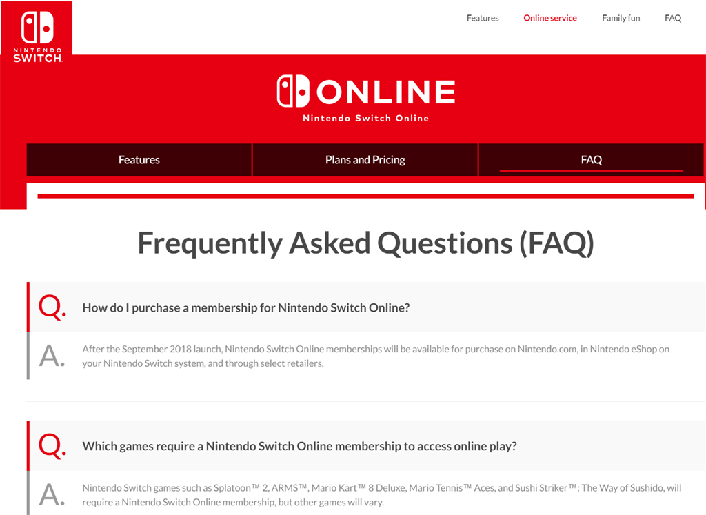
1. Nintendo
The Nintendo Online FAQs are bold, functional
and simple in approach.
The content isn’t cluttered and easy to skim
read.

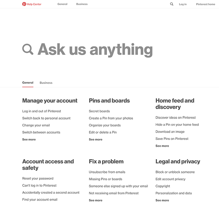
2. Pinterest
It's no surprise that a visual social platform like Pinterest would have a bold Help Center.
Pinterest's Help Center is clearly prioritized for the mobile user with easy navigation.

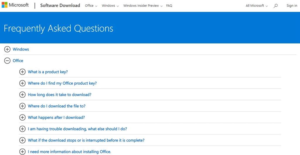
3. Microsoft
Microsoft's FAQs section uses accordion / expandable functionality for a more effective mobile-first experience and to support quick access to information without needing to scroll and scroll.

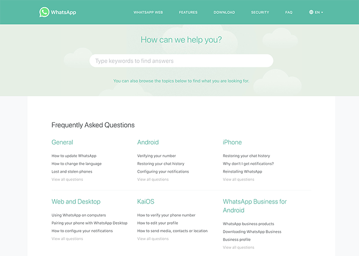
4. WhatsApp
The FAQ resources for WhatsApp is bright, easy to use, and categorized for quick desktop or mobile use.

5. YouTube
YouTube's FAQ page is simple to use and provides access to the most commonly asked "help" topics.

6. Ancestry DNA
Ancestry DNA included some FAQs directly accessible from their homepage. They also utilize an accordion functionality and include links to other pages on their website within the answers.

7. Baskin Robbins
In this case, Baskin
Robbins FAQ page has a “jump” feature, so when you click on the question in
the dropdown at the top it brings you down the page to the question you
selected.
This allows all of the answers to be visible at once, but
also makes it so you don’t need to scroll to find a particular one.

8. Cards Against
Humanity
The Cards
Against Humanity section is obviously written in the same crude humor
that makes the card game so notorious.
Your FAQs don’t have to be boring, in fact they should encourage people to
delve further into your website, not send them away.

9. Death Wish Coffee
Death
Wish Coffee not only tries to eliminate frustration with customer service
and shipping questions, but it also utilizes its FAQ page to tout what makes it
special and links over to another internal page.

10. Netflix
Another great example of a well-organized FAQ page is the Netflix Help Center.
It features columns of the top questions that link over to
the corresponding answer page in addition to offering ways to contact them with
further questions at the bottom.

By optimizing your Frequently Asked Questions section on
your website, you can easily help your audience find answers and avoid some
customer service issues in addition to helping your website rank in more search
results.
Call us at (407)
682-2222 to find out how we can help craft the perfect FAQ page for your
business.